.jpg)
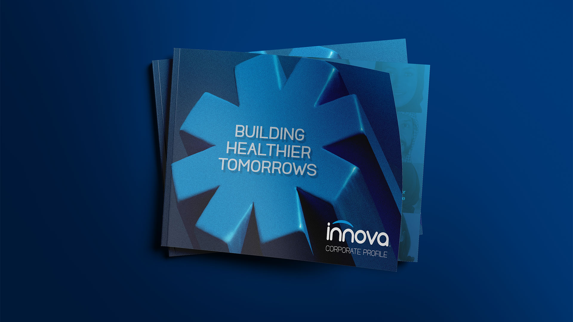
Reimagining Wellness. Redefining Trust.
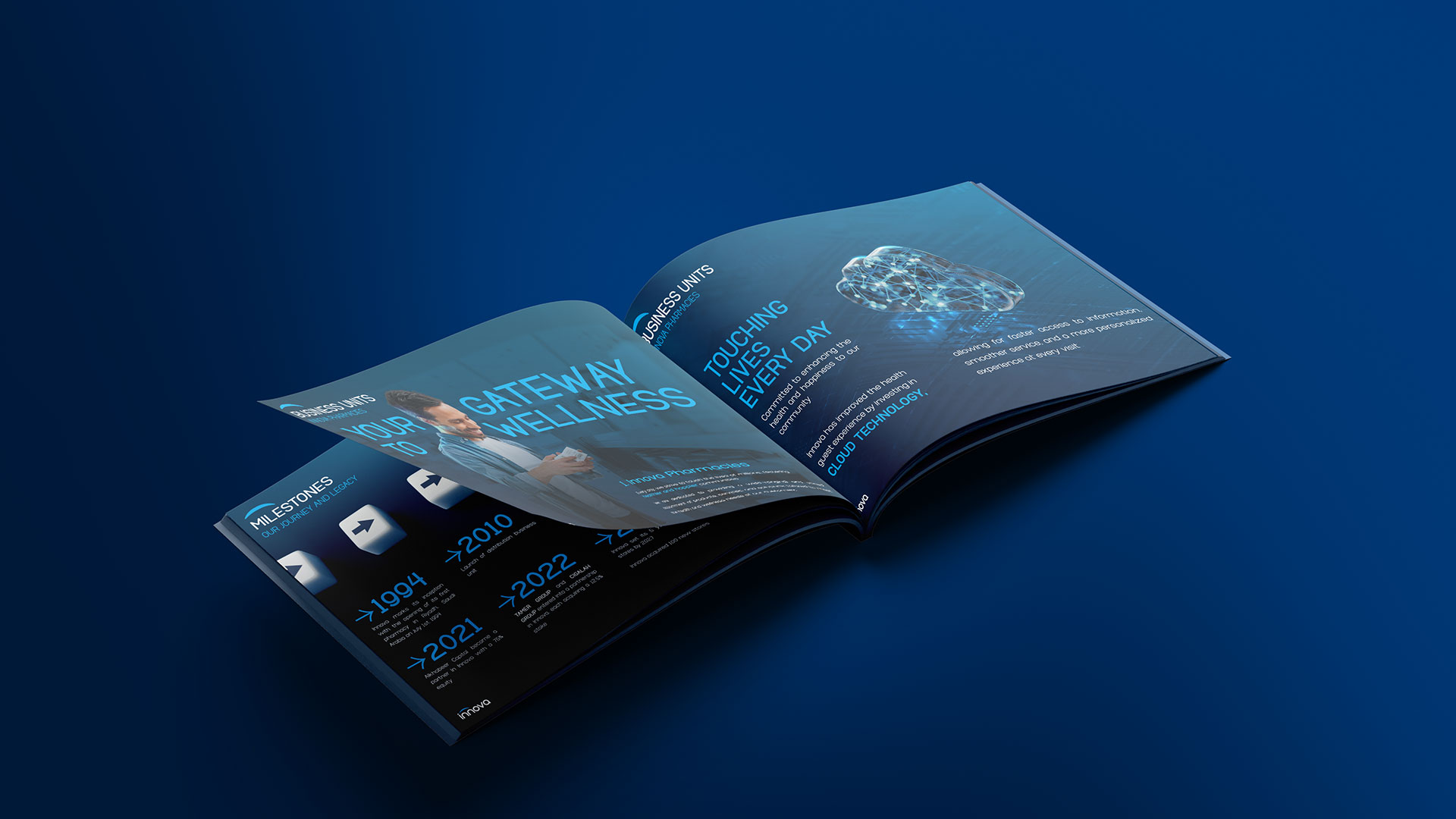
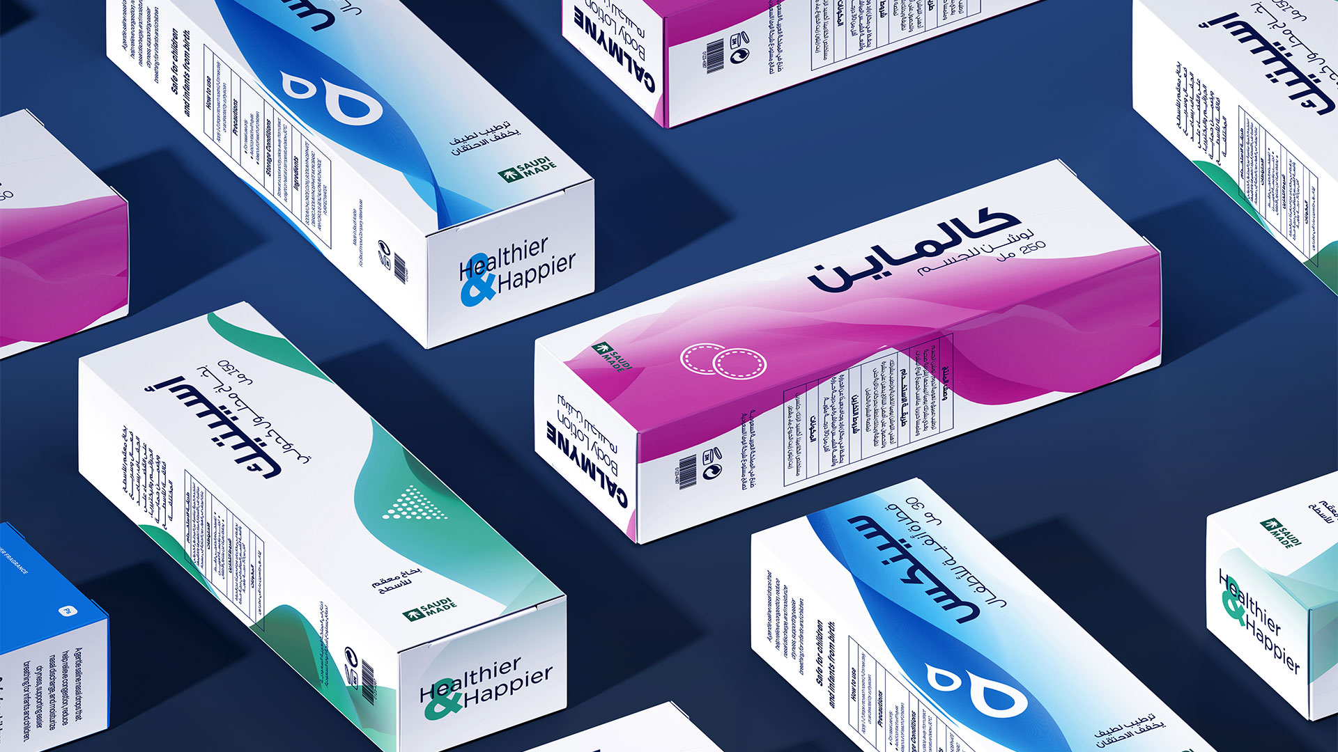
Innova Pharmacies — formerly known as Beit El Seha — embarked on a complete rebranding journey to transform into a modern healthcare brand focused on improving everyday wellbeing. The new identity captures both healthcare expertise and human warmth — turning professional care into a personal experience.
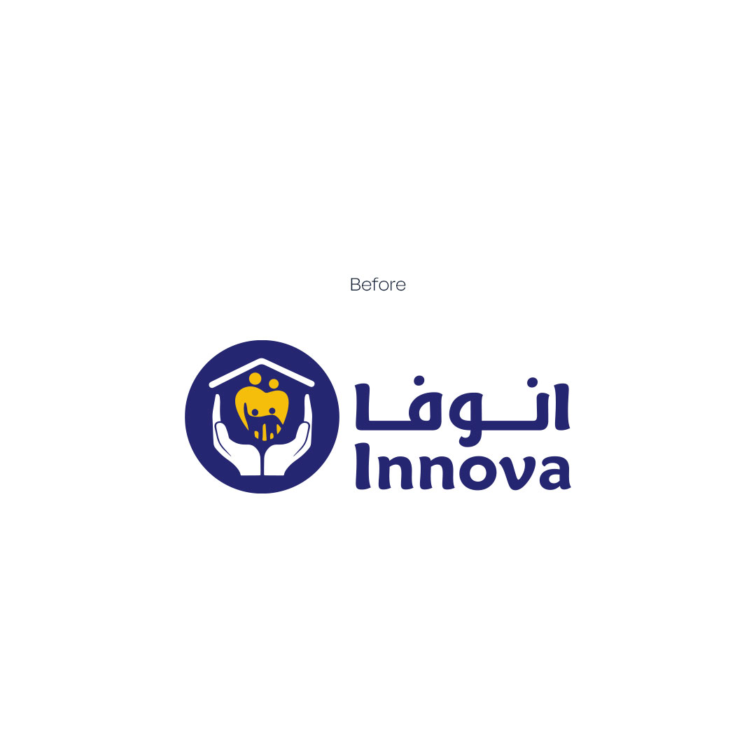
We wanted Innova to feel less clinical and more human — a brand that connects emotionally, not just functionally. Every visual detail was crafted to feel comforting, sincere, and close to people’s daily rhythm.
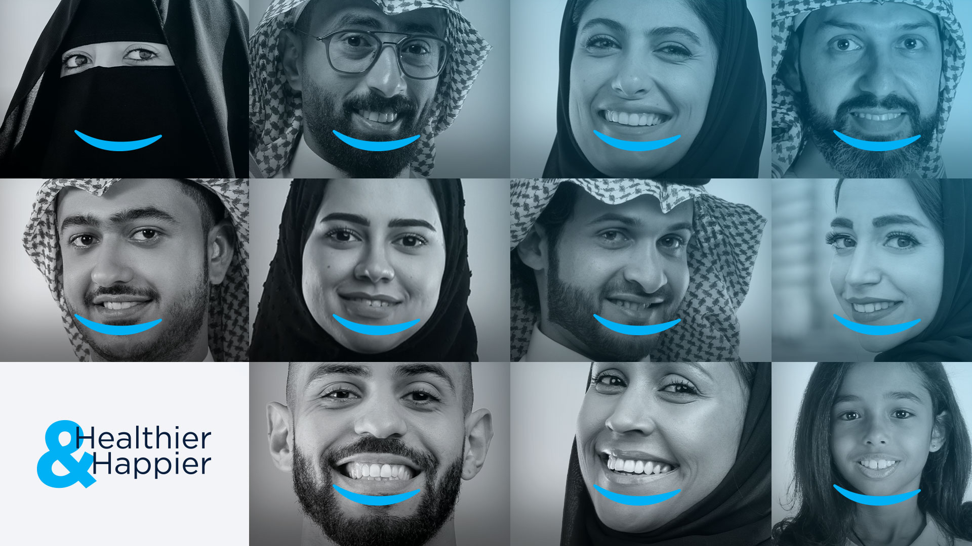
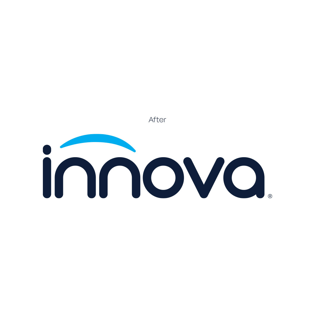
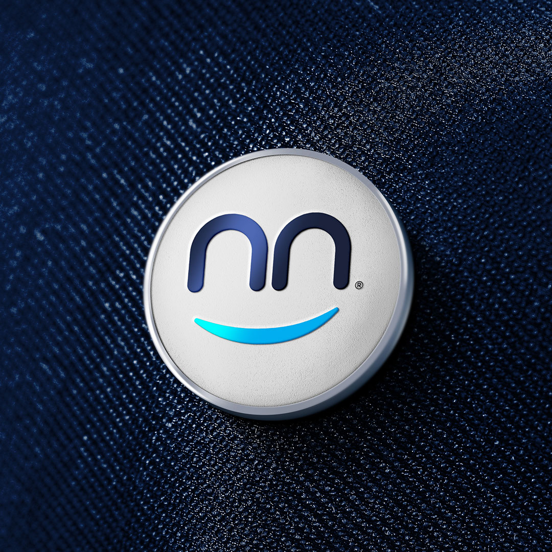
At the heart of the identity lies a simple arc — gentle yet meaningful. It forms both a smile that spreads positivity, and a shield that protects. A perfect balance between happiness and safety — the essence of Innova’s promise.
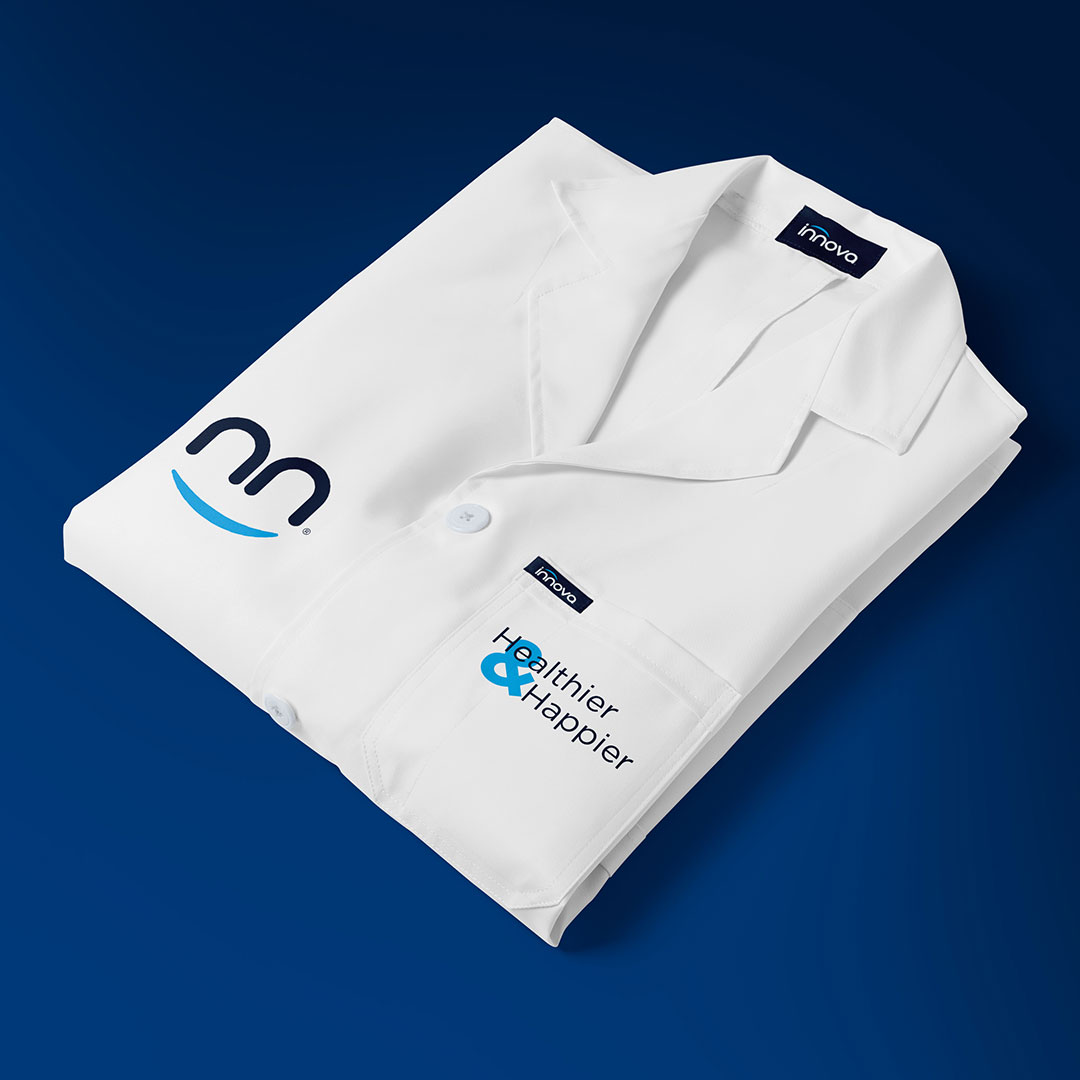
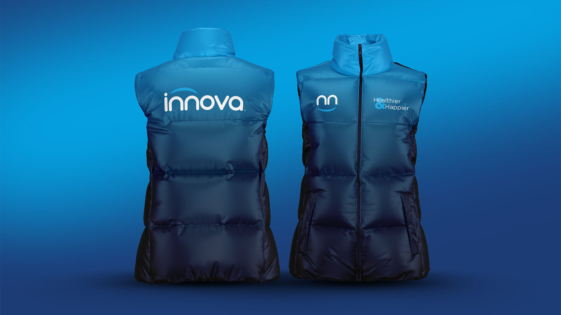
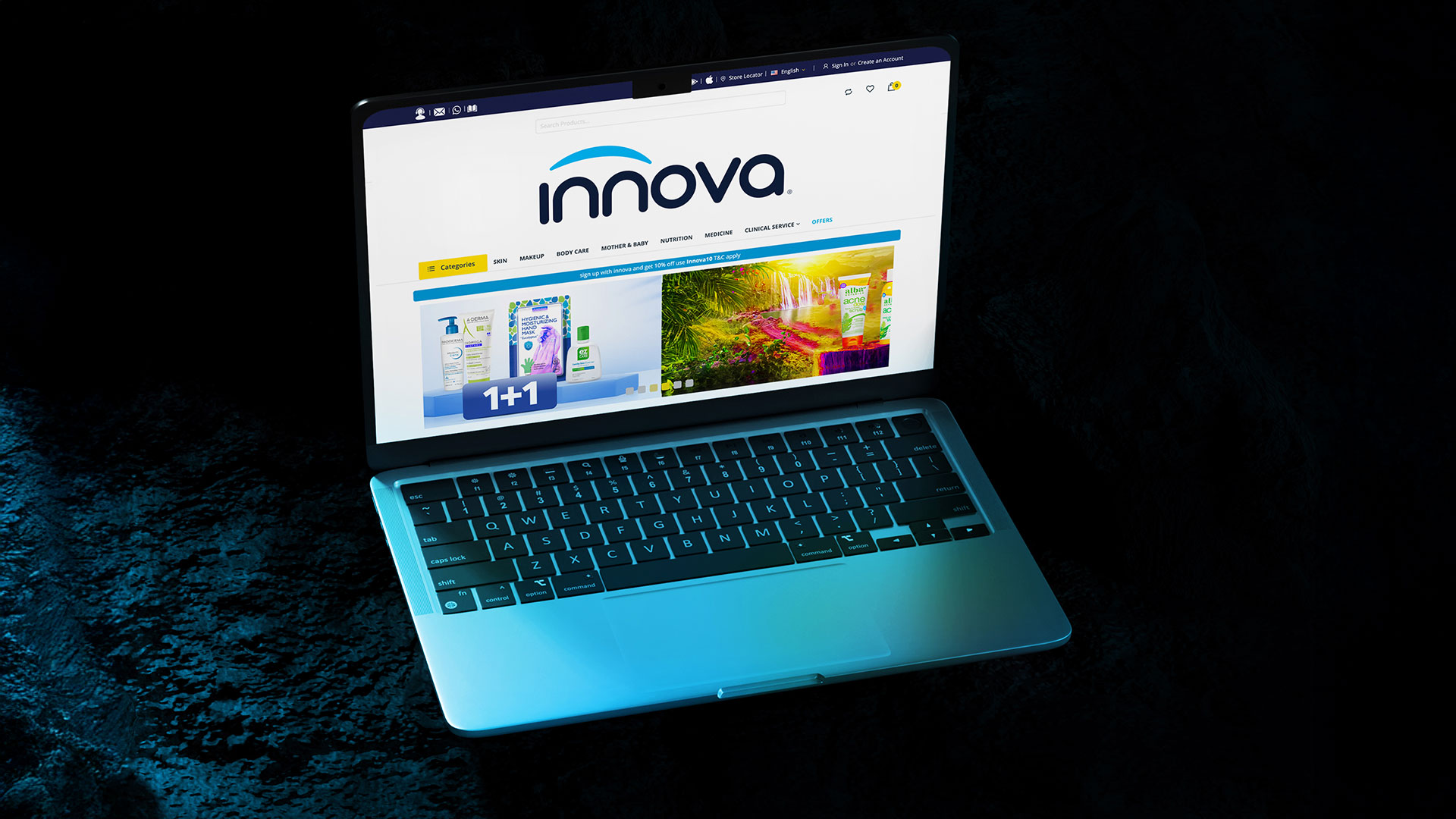
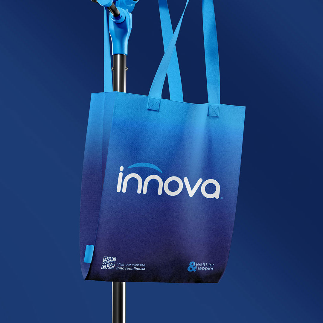
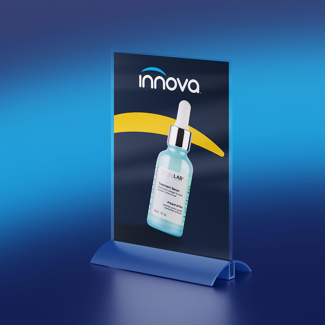
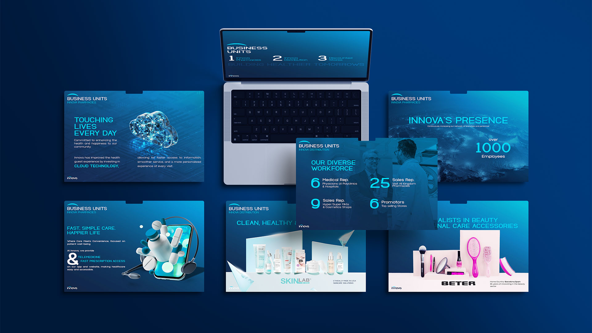
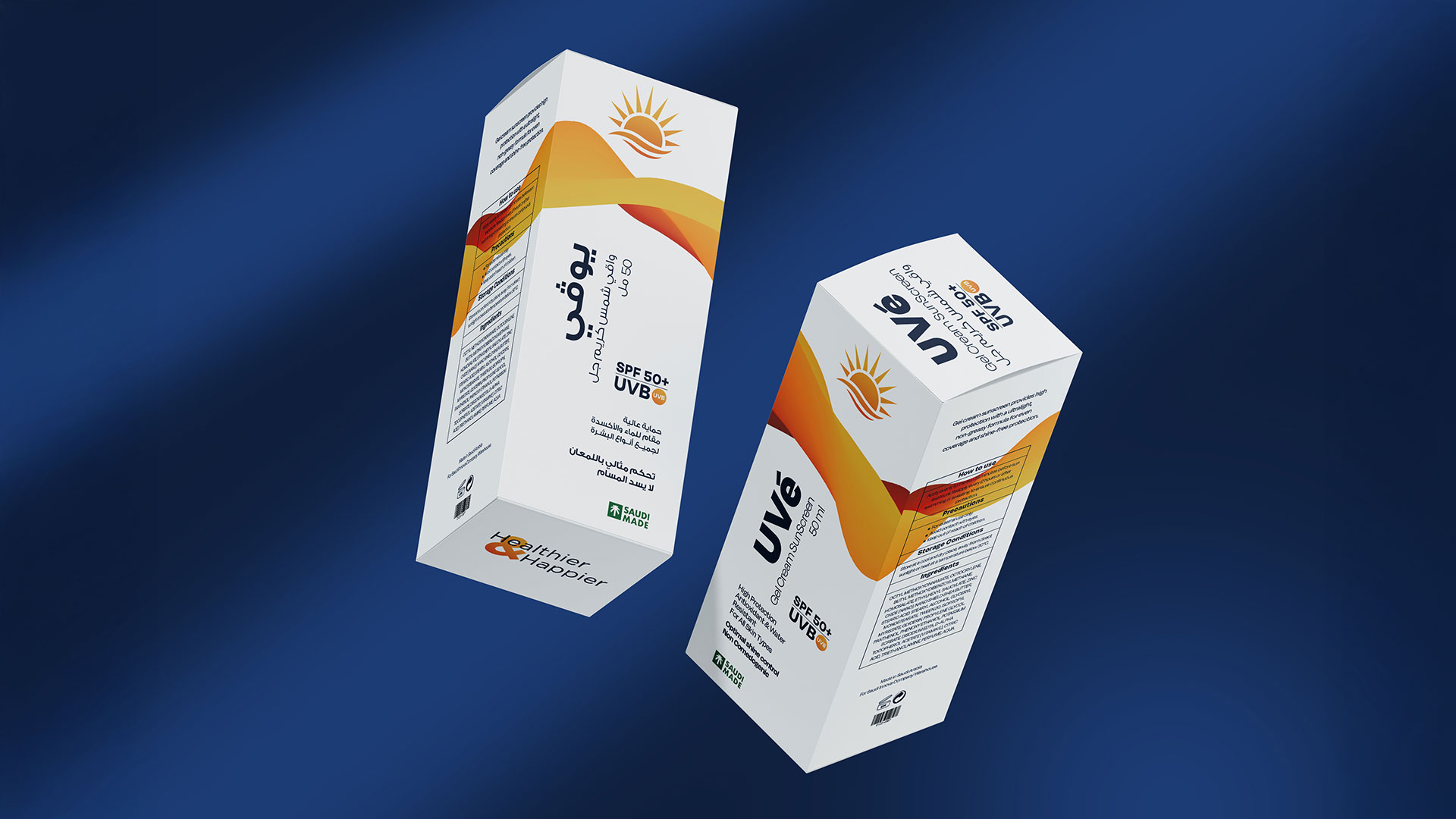
From uniforms to packaging and interiors, every touchpoint was built to express care and consistency. The design doesn’t just look clean — it feels right, human, and modern.
Leading the rebranding process meant shaping not just visuals, but emotion. From strategy to execution, every step aimed to give Innova a new pulse — one that reflects its people, its purpose, and its promise.

be a part of the jumppeak family
 Ar
Ar
'%20fill='%23CD01D6'/%3e%3crect%20x='22'%20width='6'%20height='28'%20fill='%23CD01D6'/%3e%3crect%20width='28'%20height='6'%20fill='%23CD01D6'/%3e%3c/svg%3e)