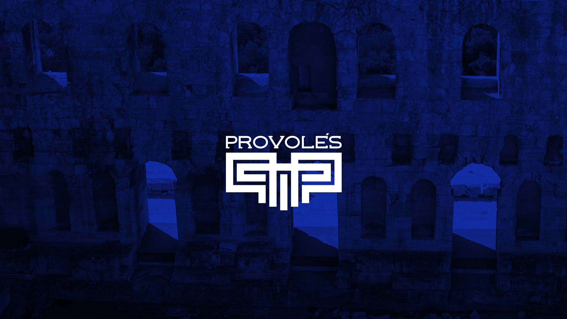
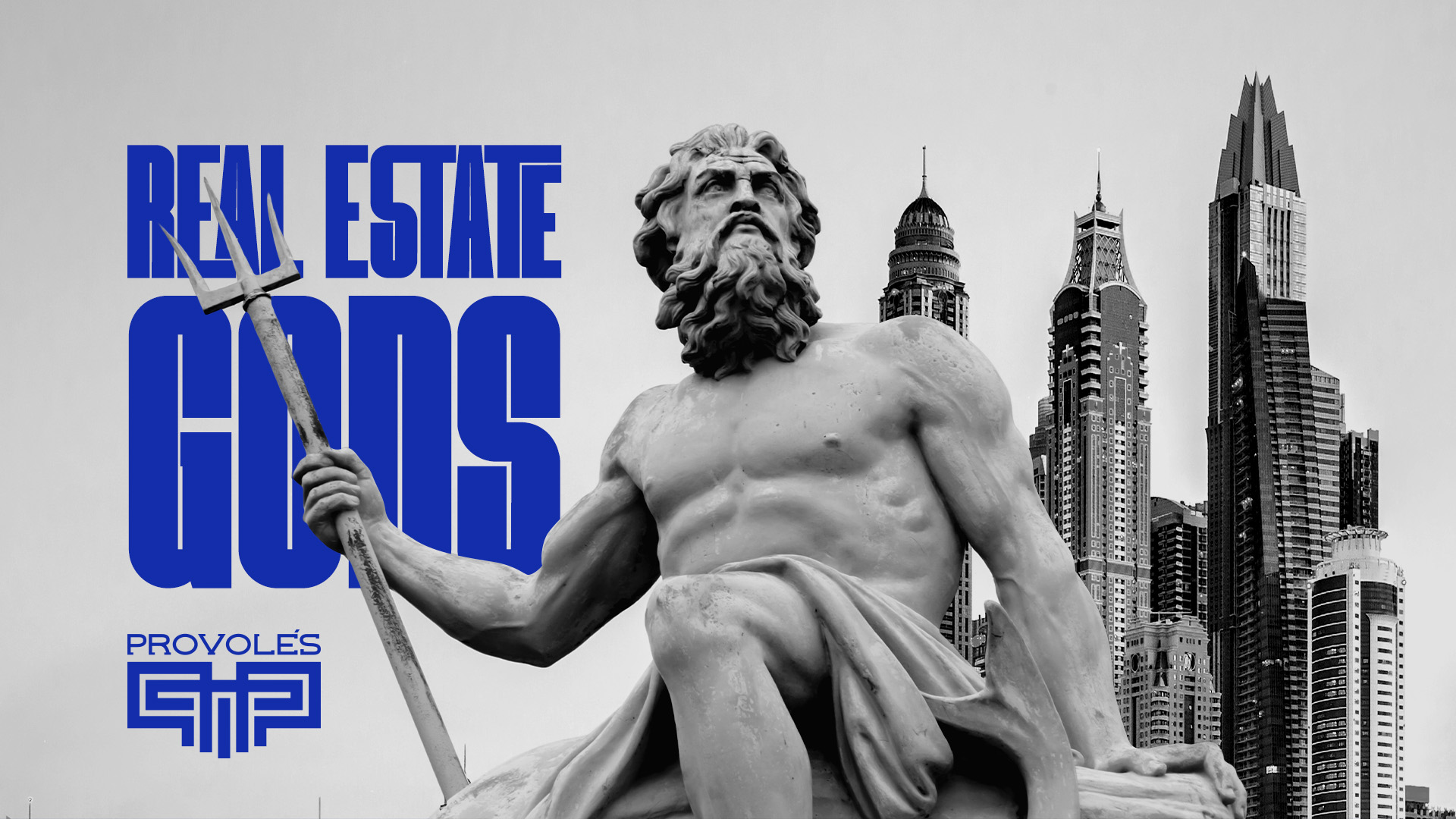
Where ancient Greek strength meets modern investment confidence.
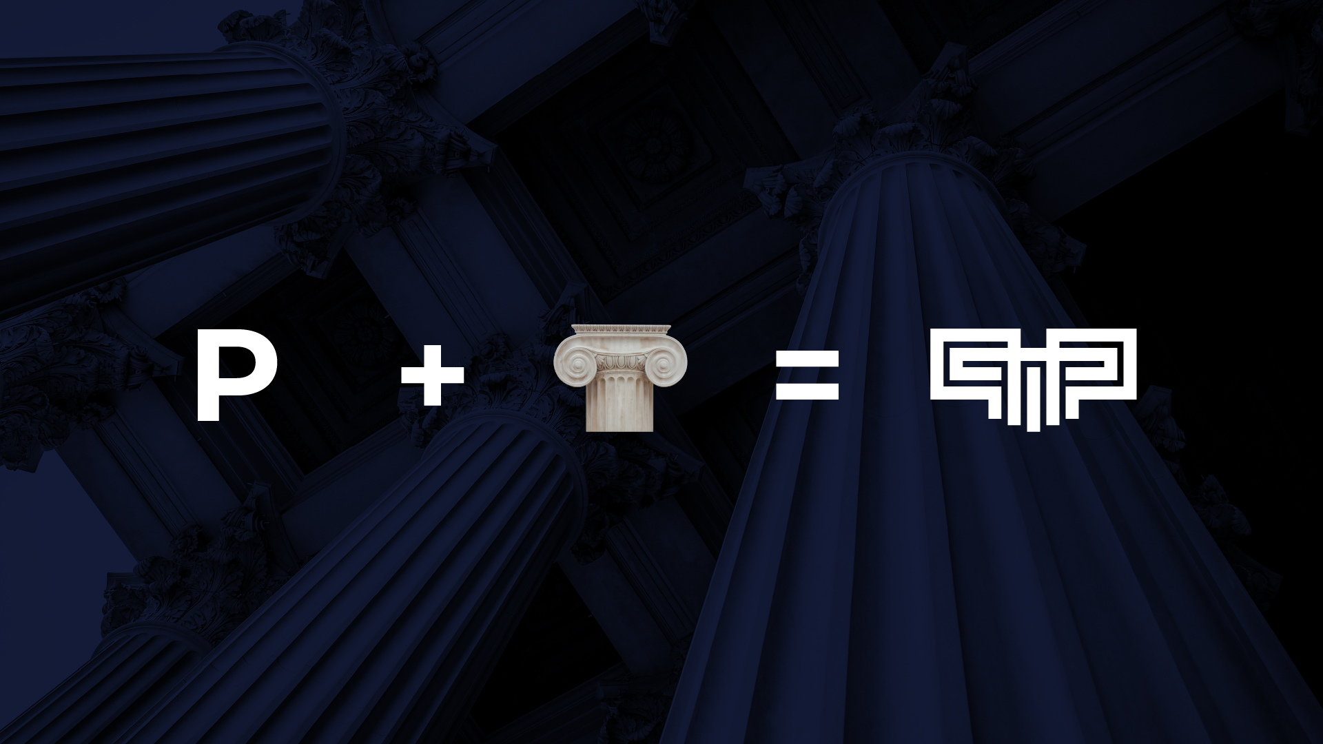
Inspired by the greatness of Greek civilization, the concept of Provoles was born from the idea of strength through harmony — where precision, geometry, and timeless architecture represent both heritage and ambition.
The identity merges the visual language of ancient Greek temples with the confidence of modern investment. Each element was designed to evoke a sense of trust, prestige, and strategic power, mirroring the brand’s role in connecting Arab investors with Dubai’s most promising real estate opportunities.
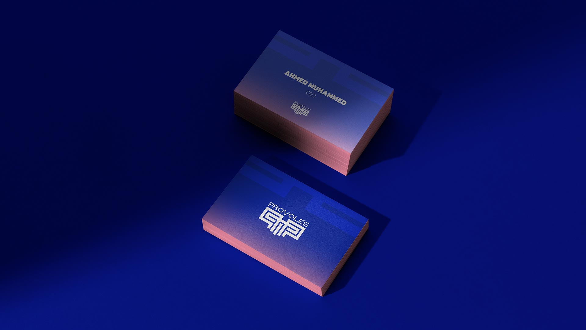
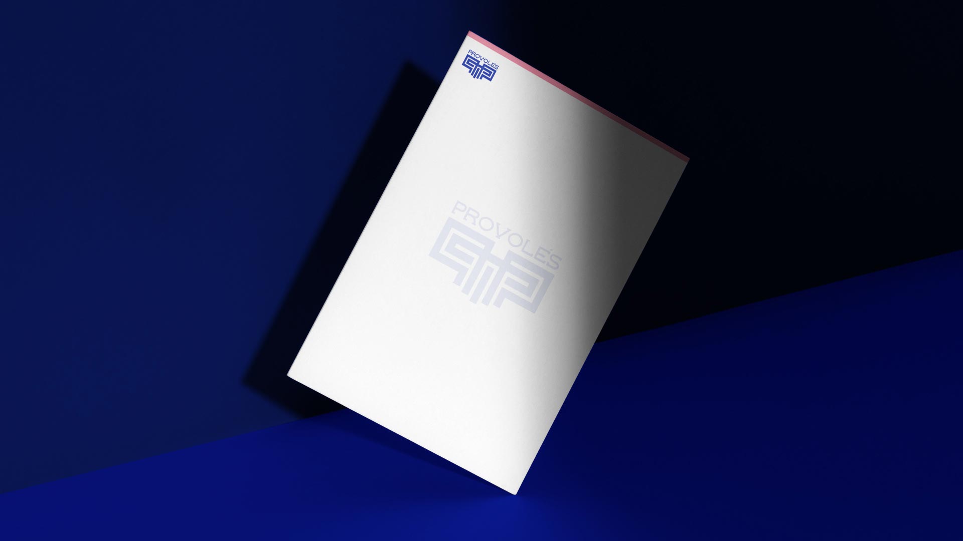
The typography system combines Meutas for its modern sharpness and IBM Plex Sans Arabic for clarity and legibility across bilingual communication. The use of Blackheat in headlines adds a monumental power reminiscent of Greek stone engravings.
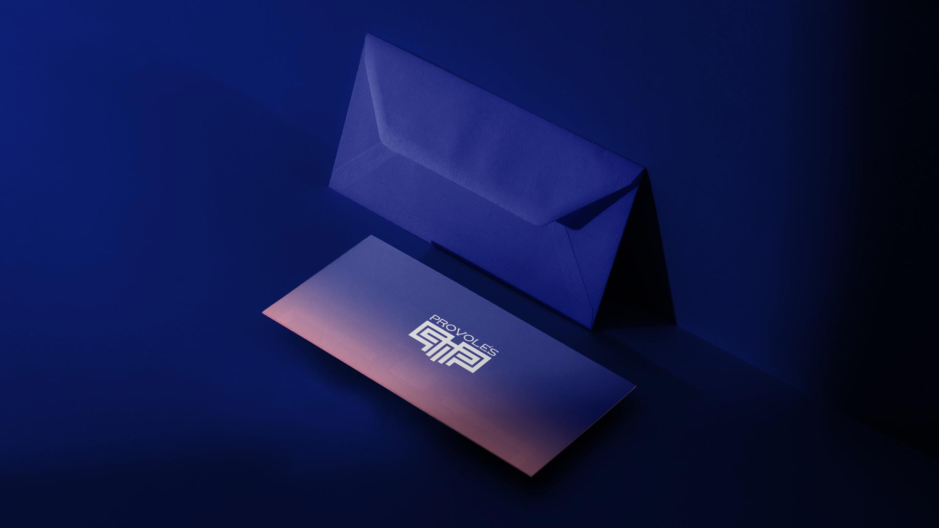
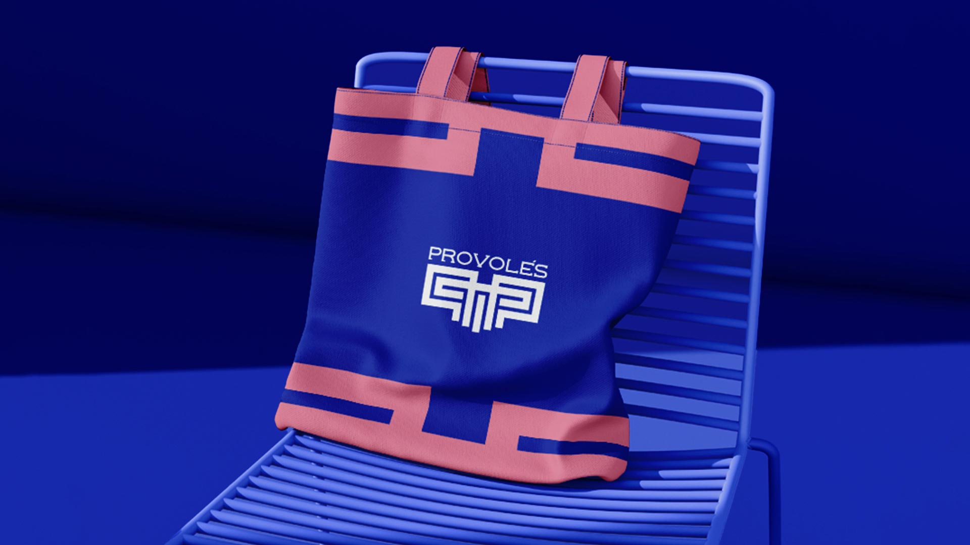
The color palette is inspired by the landscapes of Santorini — royal blue representing trust and depth, white symbolizing purity and clarity, and soft pink introducing a refined modern contrast.
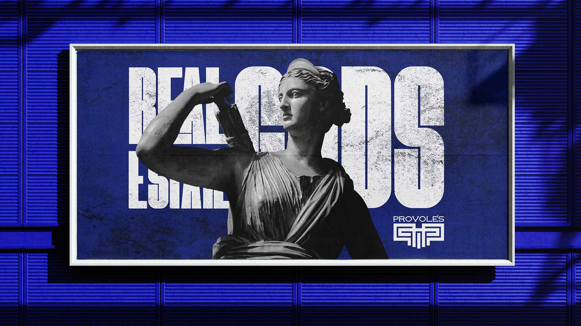
The visual identity of Provoles celebrates a dialogue between heritage and modernity. The sharp lines and geometric precision express the structure and logic of investment, while the monumental visuals of Greek statues highlight timeless strength and prestige.
The balance between minimal design and bold storytelling gives the brand a distinctive and memorable presence across all touchpoints — powerful, elegant, and deeply rooted in its narrative.
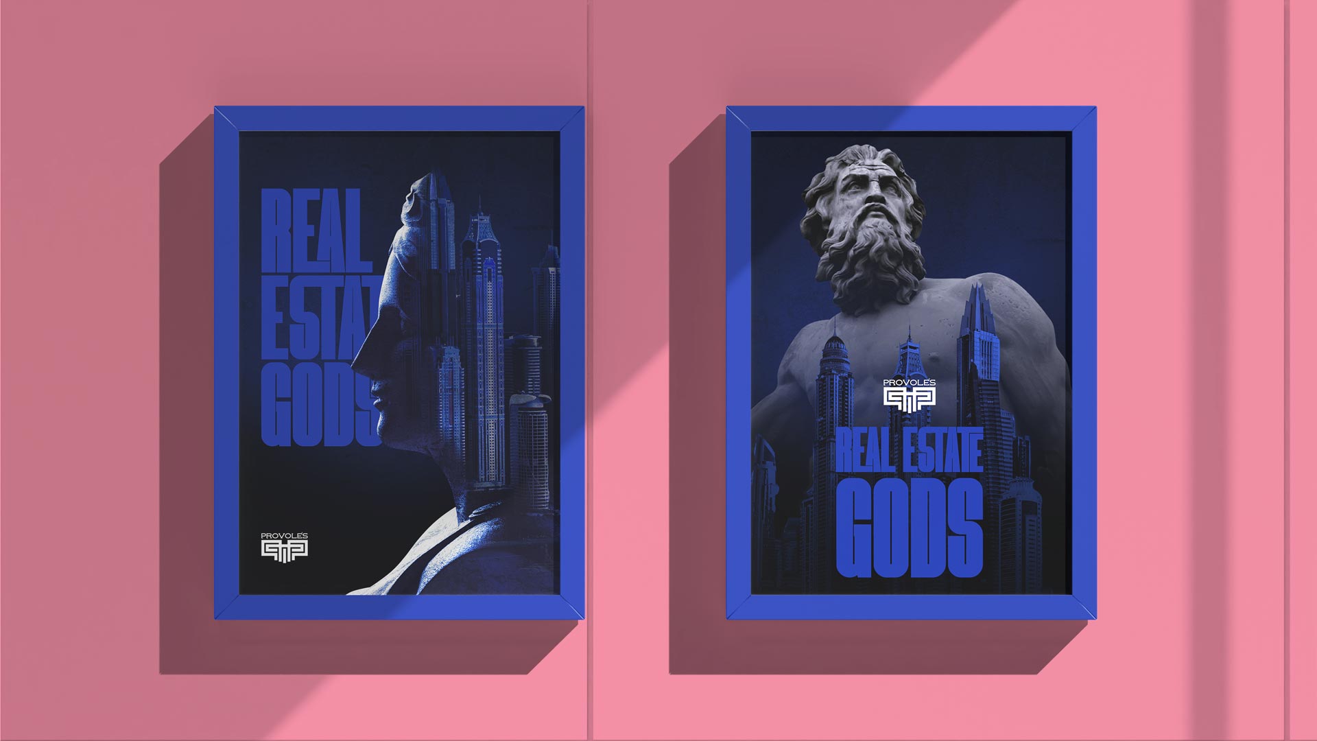
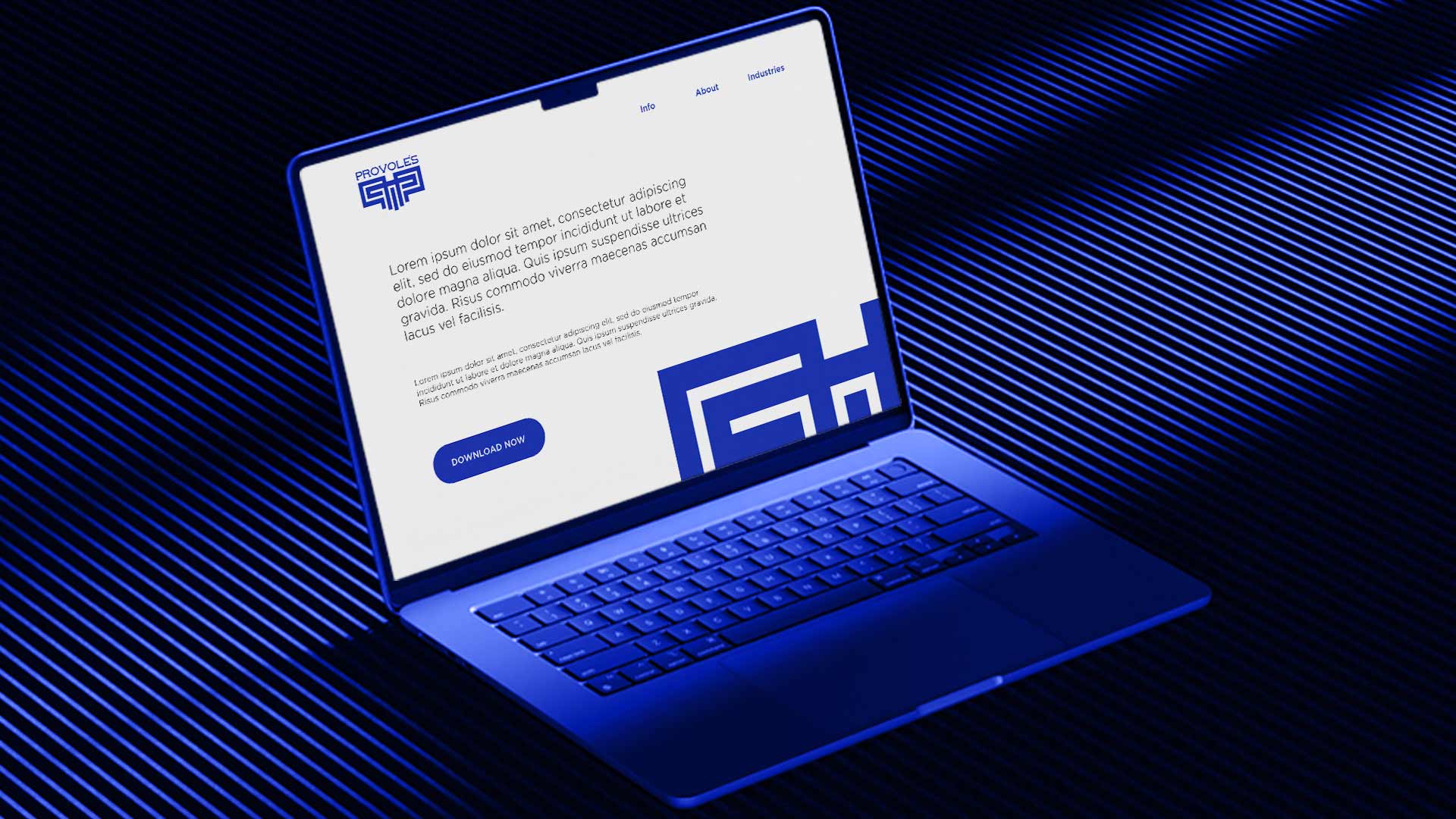
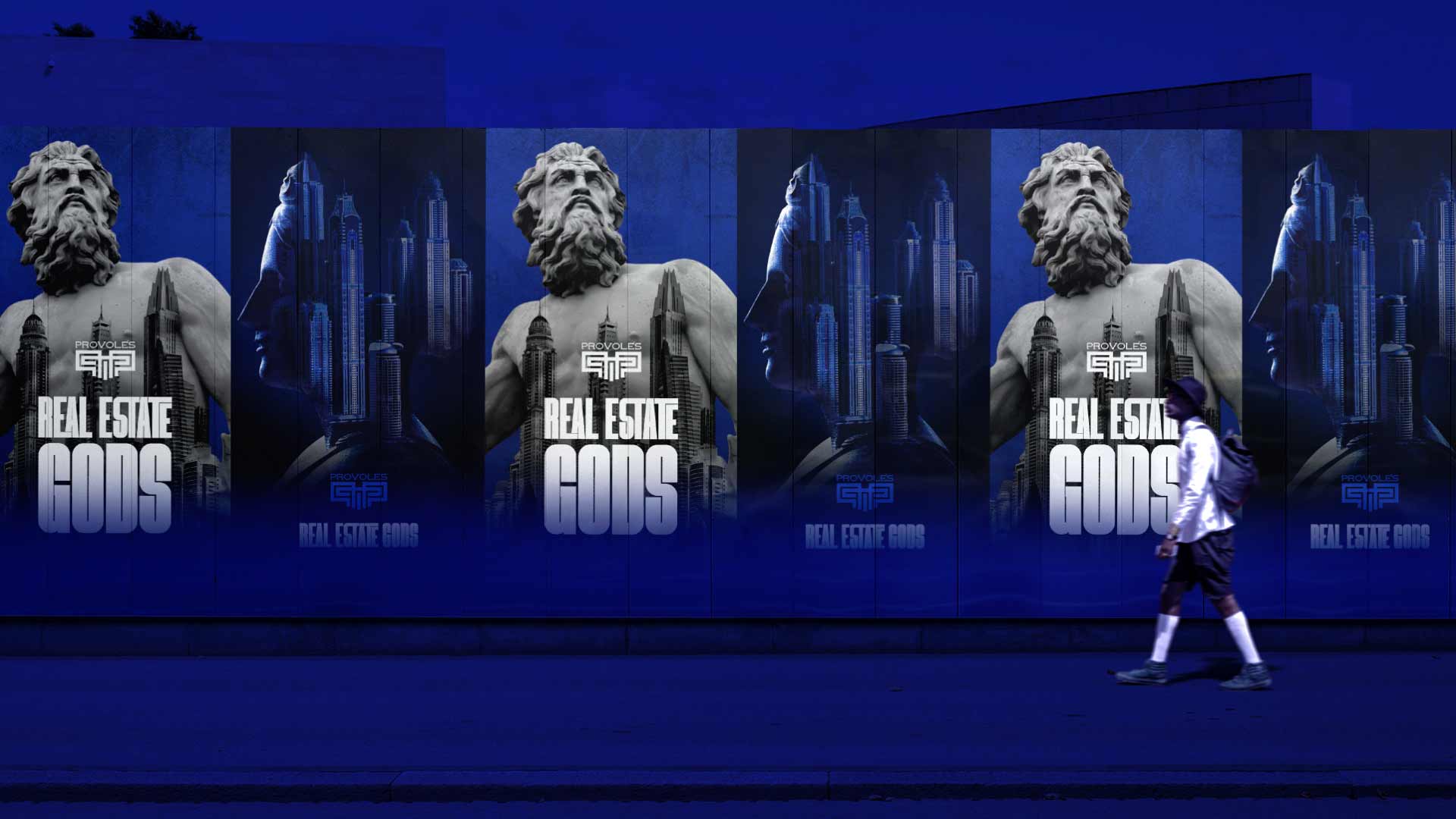
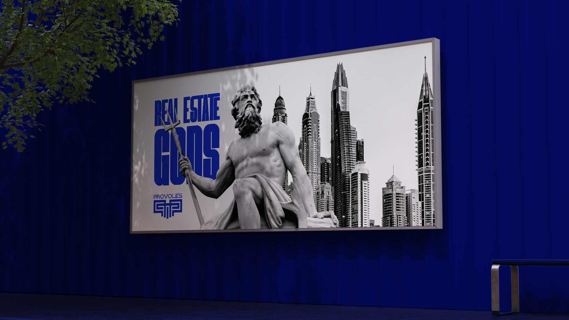
From business cards to billboards, every application reflects the authority and refinement of Provoles. The logo, with its symmetrical architecture, becomes a seal of excellence — instantly recognizable and symbolizing stability.
The communication visuals position the brand as “Real Estate Gods”, connecting mythic strength with real-world investment power — a brand that stands proud among Dubai’s skyline.

be a part of the jumppeak family
 Ar
Ar
'%20fill='%23CD01D6'/%3e%3crect%20x='22'%20width='6'%20height='28'%20fill='%23CD01D6'/%3e%3crect%20width='28'%20height='6'%20fill='%23CD01D6'/%3e%3c/svg%3e)